
Introduction to Document Accessibility: List of Best Practices


General
| Category | Best Practice |
|---|---|
| Accessible by Design | Think about accessibility from the start—like adding blueberries before baking muffins. |
| Keep it Simple | Create simple documents with text, headings, images (with alt text), and simple tables (with one header row). |
| Text & Layout | Use at least 18pt font for presentations and 12pt for other documents. Space out text (1.5 line spacing), keep it left-aligned, and break it into short paragraphs. |
| Headings | Use real heading styles in a logical order (H1 for titles, H2 for sections, etc.). |
| Links | Write clear, descriptive links (e.g., “Learn more about accessibility” instead of “Click here”). Underline and use colour so links stand out. |
| Images | Add alt text for meaningful images, mark decorative images as such, and include image descriptions when more context is needed. |
| Tables | Use tables only for data—not for layout. Keep them simple with a single header row. |
| Emphasis | Highlight important info using text like “Important” instead of relying only on colour, visual methods, or symbols. |
| Accessibility Checkers | Use built-in checkers in Word, PowerPoint, Excel, and Adobe Acrobat to catch common issues. |
| Manual Checks | Always double-check accessibility manually—automated tools can’t catch everything. Review: alt text accuracy, proper reading order, and logical content structure. |
Microsoft Word
| Category | Best Practice |
|---|---|
| Headings | Use real heading styles and don’t skip levels. |
| Table of Contents | Use Word’s built-in table of contents to leverage headings and ease navigation, especially for speech recognition users. |
| Lists | Group related content with real lists to communicate structure to assistive technologies and layout content intuitively. |
Microsoft PowerPoint
| Category | Best Practice |
|---|---|
| Design Themes | Use built-in design themes for better structure and reading order. Avoid complex backgrounds with gradients and patterns. Modify colours in Slide Master. |
| Reading Order | Add content in logical order and review the reading flow with the Selection Pane—title first, then body text. |
| Lists | Category Best Practice Design themes Use built-in design themes for better structure and reading order. Avoid complex backgrounds with gradients and patterns. Modify colours in Group related content with real lists to communicate structure to assistive technologies and layout content intuitively. |
Microsoft Excel
| Category | Best Practice |
|---|---|
| Worksheet Names | Use unique, descriptive worksheet names instead of default “Sheet1” names. Delete unused sheets. |
| Cell A1 | Start with Cell A1 for orientation info. Avoid blank A1 cells. |
| Text Visibility | Ensure text in cells is fully visible using “Wrap Text” or resizing columns. |
| Blank and Hidden Content | Avoid unnecessary blank sheets, rows, and columns. If needed, add one blank row to separate tables. Mark intentionally blank cells with “No data”. Avoid hidden rows and columns. |
| Category | Best Practice |
|---|---|
| Word vs. PDF | Provide multiple formats (like Word). Only offer essential PDFs (editable forms) to reduce remediation costs. |
| Save as PDF | Use “Save as PDF” with accessibility options enabled—never “Print as PDF.” Steps vary slightly by program. |
How to open the Accessibility Checker
Word, PowerPoint, and Excel
The instructions are the same across Word, PowerPoint, and Excel on Windows, macOS, and Web versions.
- Select the Review tab.
- Select Check Accessibility.
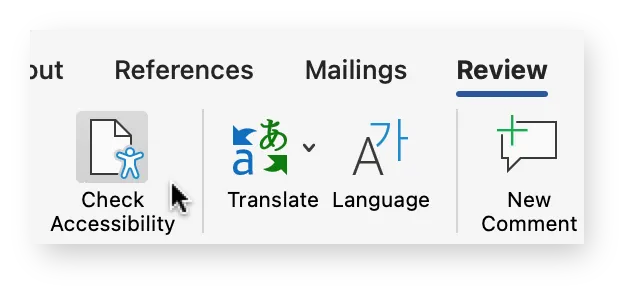
The Accessibility pane will open on the right. To learn more, see Microsoft’s support article Improve accessibility with the Accessibility Checker.
Adobe Acrobat Pro
- From the global bar, select All tools.
- From the left panel, select View more > Prepare for accessibility > Check for accessibility.
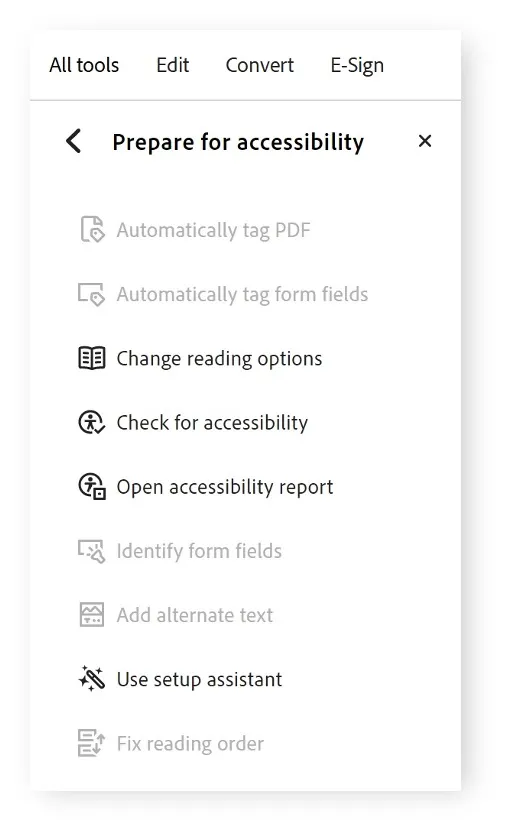
From the Accessibility Checker Options dialog, keep all options selected and select Start Checking.
The Accessibility Checker panel will open on the right.
To learn more, see Adobe’s support article Create and verify PDF accessibility.